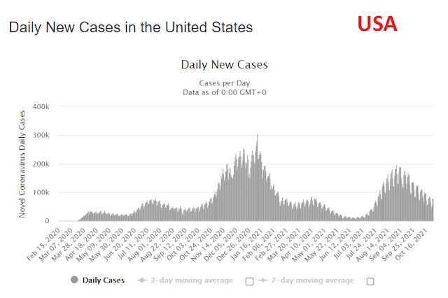
I haven't looked at COVID stats or graphs for months. I thought I'd take a look today to see how we're doing in terms of infection waves. While I was at it, I took a look at the graphs of a few other countries. The discrepancy in the infection profiles between the countries is incredible. The relative extent of peaks and troughs, timing (even accounting for seasons), duration of peaks and sheer numbers.
I dropped a note to my friend in the know, mentioning how we have proper lows and proper spikes, while other graphs have less distinction.
She replied, "We do things properly here (laughing emoticon). I think they have maybe controlled the spikes better than us and that’s why there is less variation, but it is interesting seeing the differences between countries".
Here are the southern and northern hemisphere countries that I took a look at (in no specific order except to place South Africa first for reference.


No comments:
Post a Comment